An app that helps visitors experience museums in a safe way
The Problem
In a time of a pandemic, museums are perceived to be unsafe for the public, causing a decline in visitors. Museums encourage visitors to crowd around exhibits, in many cases offering tactile experiences, such as pressing buttons to play videos or interactions with touch screens. These type of experiences can be a health risk as it leads to the spread of viruses.
Solution
In order to ease visitor’s fears and encourage museum visits, I propose designing an application that minimizes the need to crowd around to read plaques, press buttons or touchscreens, thus reducing the risk of spreading viruses.
UX Designer Role
Design Thinking, User Research, Information Architecture, Visual design, Accessibility Design, Prototyping and Testing
Client
Conceptual Project
Summer 2020
Design Process
Discover Phase
User Research
In order to explore the problem further and learn about the users, I began my research conducting user interviews. The interviews helped me understand the audience, their enthusiam for museums, and their fears and concerns about visiting one.
Insights From Interviews
Museum goers enjoy museums for the learning experience and escapism.
Museums get crowded and is the main reason people hesitate to visit.
They don’t feel comfortable touching buttons and touchscreens, therefore would miss out on museum content.
Escapism and learnability is lost when all you do is focus on people around you and avoid touching things.
Some people would be more open to visiting if they’re guaranteed guidelines would be followed.
Museums Analysis
In order to explore a solution, I needed to understand what museums do for their visitors. What precautions are they taking to keep people safe. I also wanted to learn about what kind of experiences they offer and analyze how these experiences could be affected by the pandemic.
What they’re doing to keep people safe
Museums implemented safety guidelines for visitors (wear masks, social distancing).
They are taking in less visitors at one time.
Scheduled times for special visitors (older people, people with disabilities).
Cleaning and disinfecting more often.
Types of experiences at museums
Guided experience involving a museum guide touring visitors.
Auditory experiences requiring visitors to carry around an iPad provided by the museum.
Virtual and/or Augmented Reality (often involves wearing headsets or using an iPad, both provided by the museum).
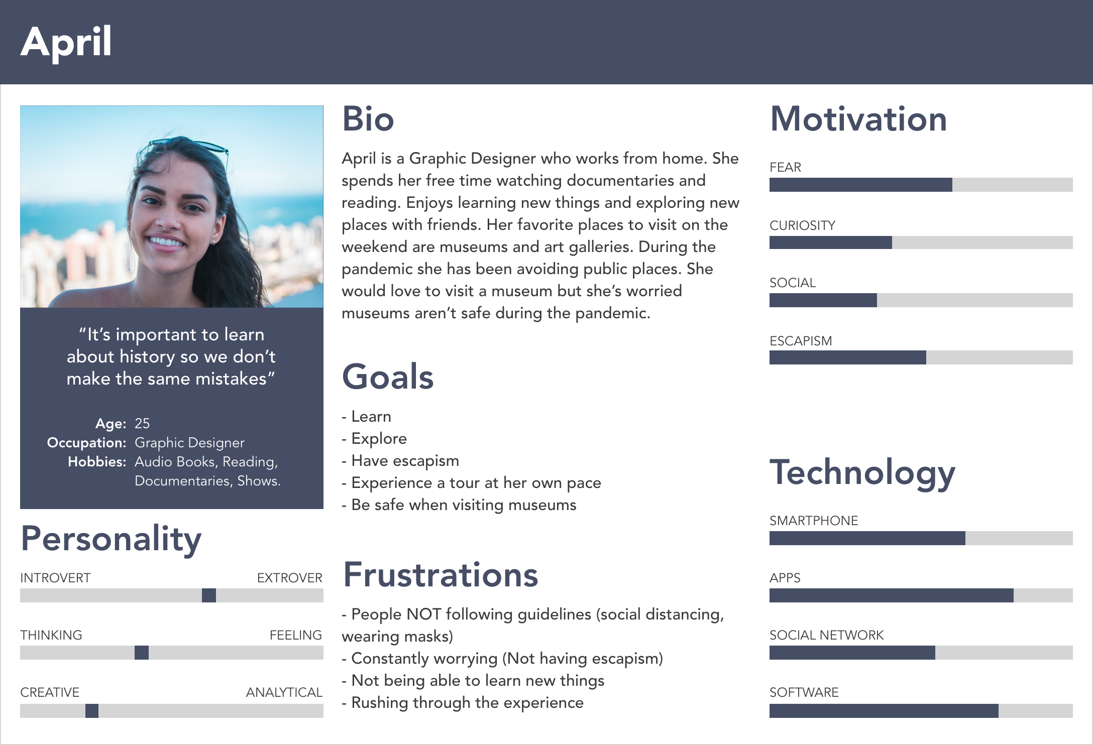
Based on the information gathered during user research, I created personas to represent the user type. The personas helped me keep the user in mind when making design decisions.
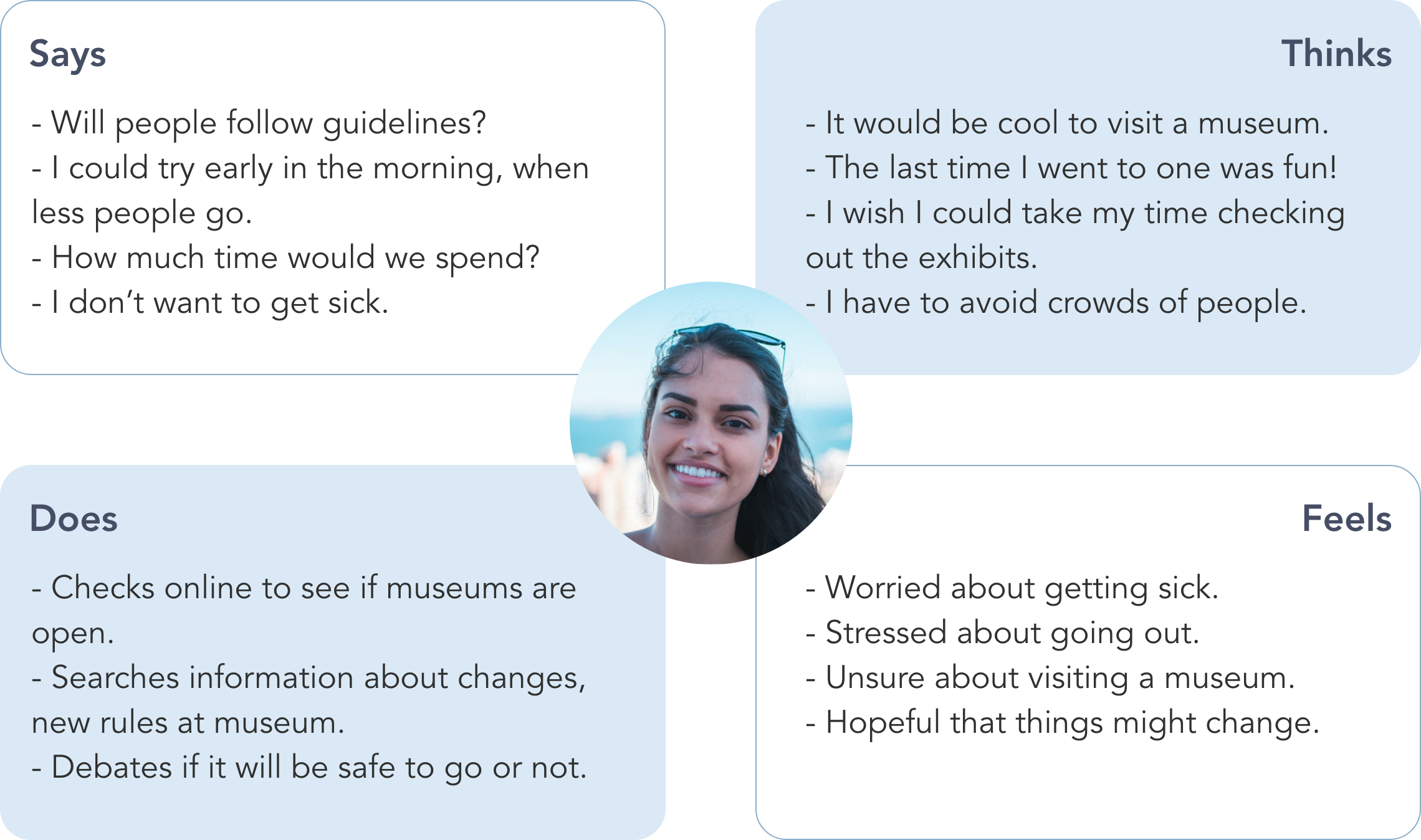
Empathy Map
The Empathy Map is meant to help illustrate the needs of the target audience. It helped me gain more of an understanding about what their thoughts and feelings are. The information on the Empathy Map is based on insight from the user interviews.
Ideate Phase
Exploring Solutions
During my research, I found three options that could replace touch screens and press buttons. I wanted to focus on solutions that would make social distancing possible while still getting the necessary information.
Proximity beacon technology
Proximity beacons emit an eco friendly Bluetooth signal and can be placed anywhere. The range of the signal can be adjusted accordingly, allowing visitors to get content instantly onto their device without the need to get close to one another.
QR Codes
QR codes work similarly to proximity beacons, except the user would have to scan each code they come across. We risk running into the issue of people gathering around to scan the codes, something we are trying to avoid.
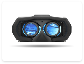
Virtual Reality
Creating a Virtual Reality tour would give users a taste of what they can expect to experience at the museum, without actually being there. Visitors could experience this at home which could potentially defeat the purpose of going to a museum.
I found that proximity beacons would be the best option. The reason being that many users can get content at once while staying at a safe distance from one another. This solution would reduce risk of infection while allowing visitors to experience what museums have to offer.
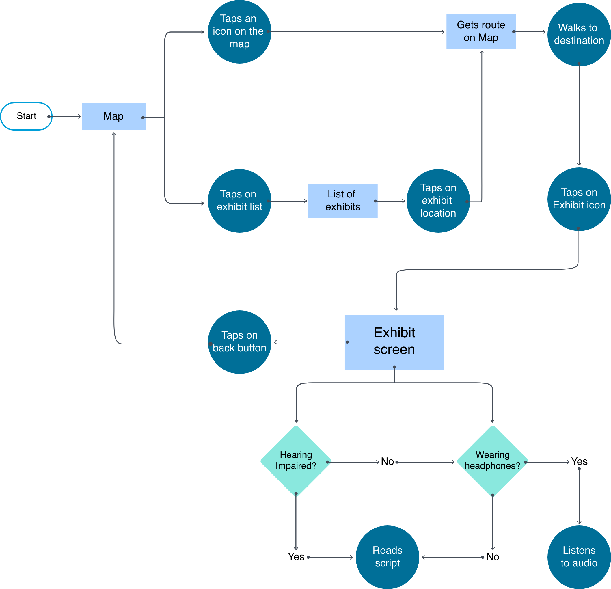
User Flow
The user flow is a visual representation of the path a user takes in order to accomplish their goal. Having a user flow helped me visualize how many screens I needed to design and how the user would need to interact with each one in order to accomplish their task.
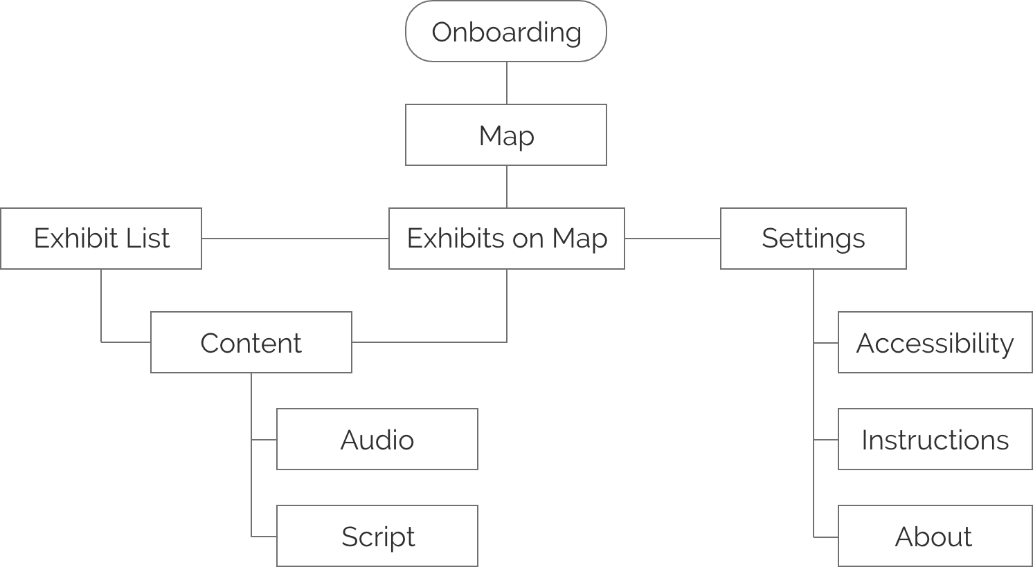
Information Architecture
With the user flow I was able to see how many screens I needed to design for, now it was time to categorize and link them together in a way that would make sense to the user.
Design Phase
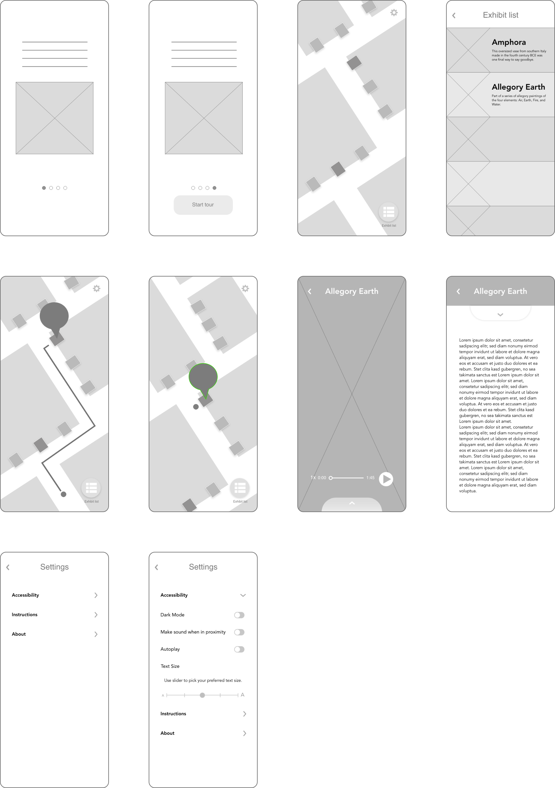
Paper Prototype
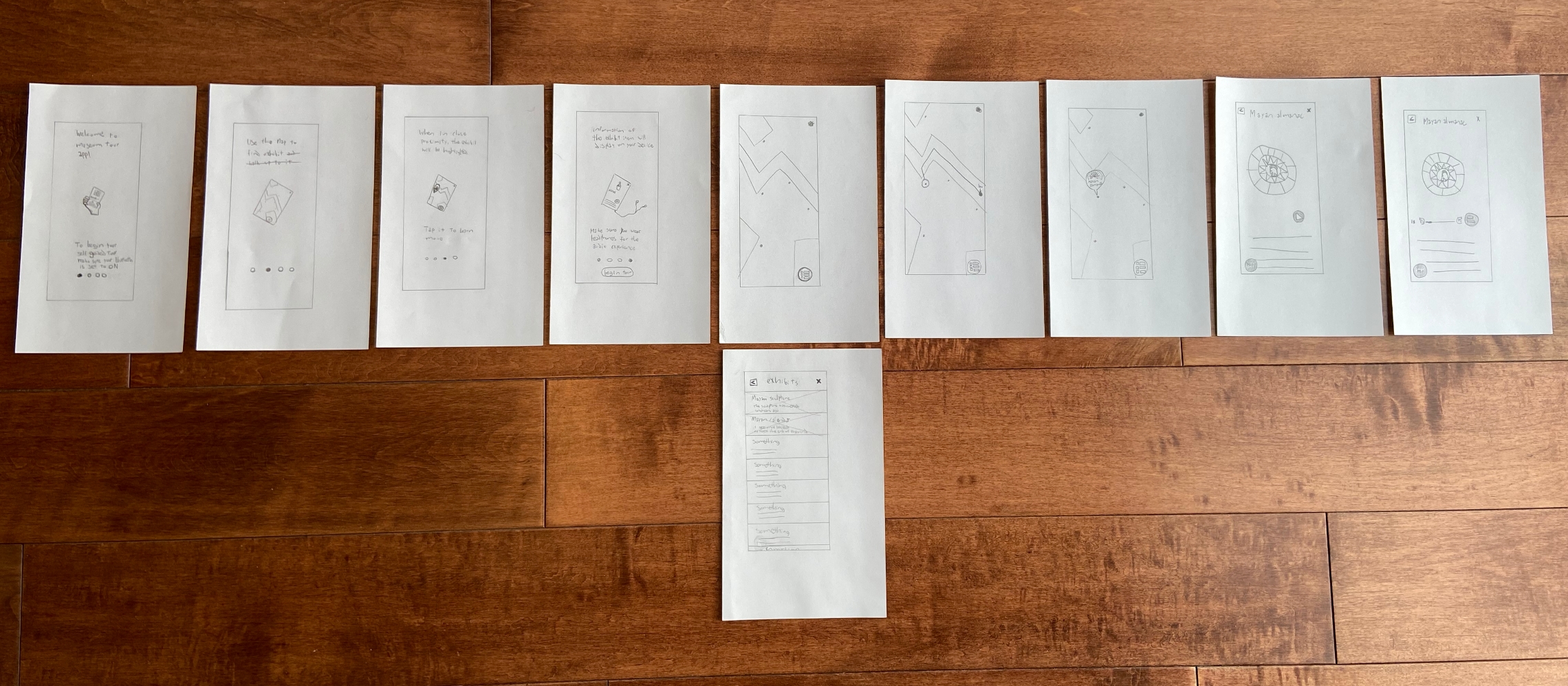
I begin sketching the different screens I was going to have. I wanted the app to be accessible and easy to navigate. My main focus was keeping people safe while giving them a unique museum experience.
1st Round of User Testing
I decided to use the paper prototype to test usability. Through observation I realized the user had a hard time understanding what to do while on the map.
Insights
Display information of the exhibit when the user selects it.
Keep showing information of the exhibit the user selected, to show where they’re going.
Have icons on the map that resemble the exhibits.
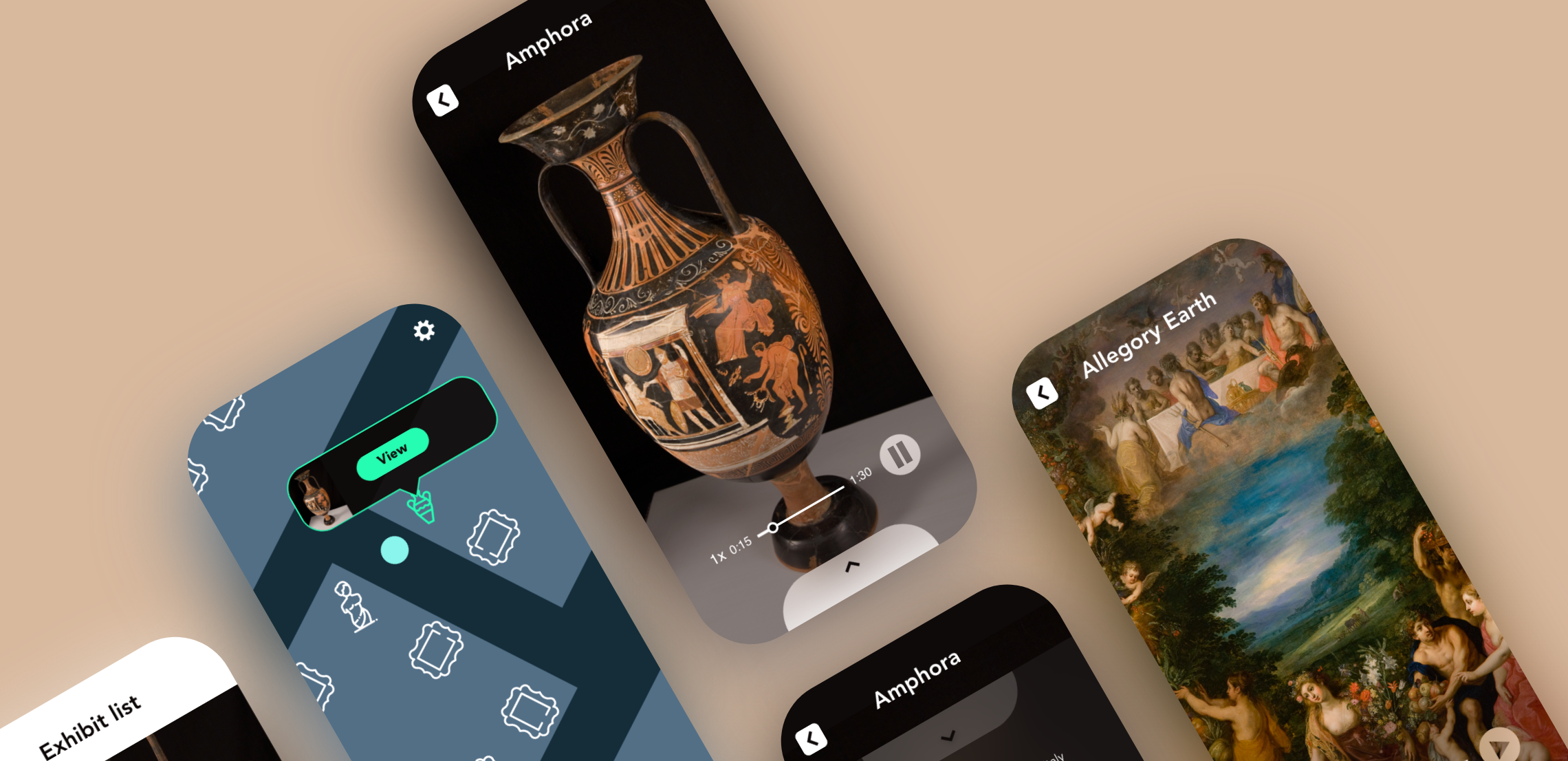
Wireframes
The lo-fi wireframe is the layout of the app with some improvements from the paper prototype. Having tested the design early on helped make the necessary changes to enhance usability.
Improvements from paper prototype
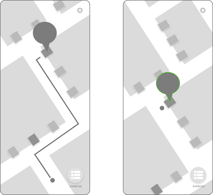
Information is displayed in the form of a text bubble when an exhibit is selected.
Text bubble gets a green outline as a visual cue when in proximity to the exhibit.
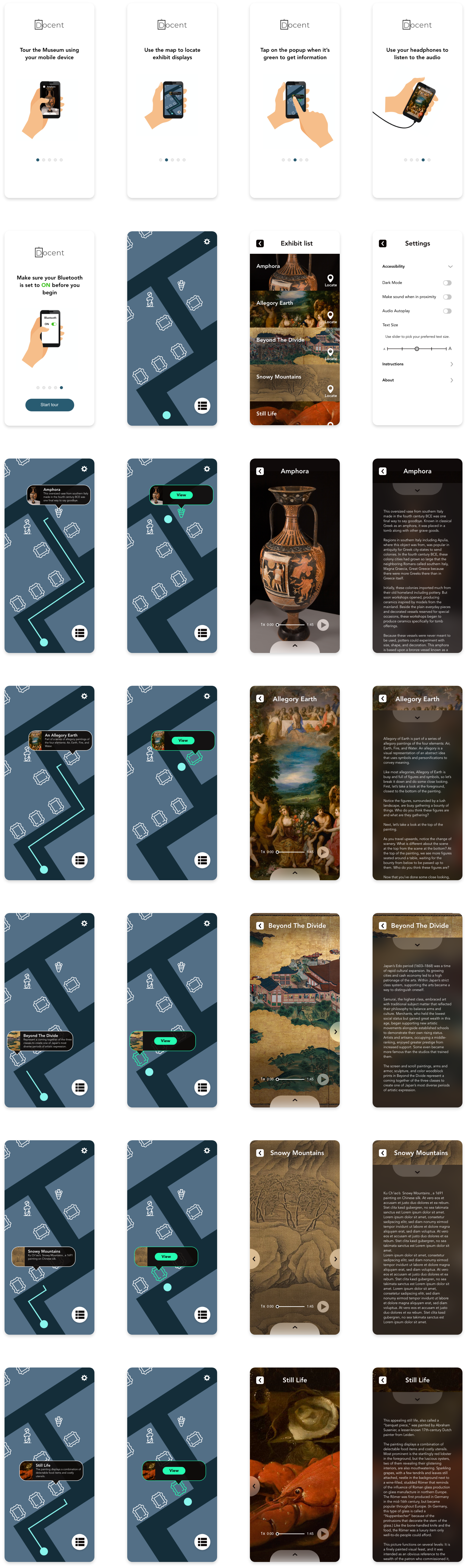
Prototype
After the visual design was completed, I turned the mockup into a prototype to do a second round of user testing.
Test Phase
2nd Round of User Testing
Using the prototype, I conducted a second round of user testing to test usability. I observed the user going through the experience completing tasks I gave them. Tasks were as follows:
Locate an exhibit on the map
Look at the list of exhibits, find one you’d like to see and locate it
View the exhibit and read the information about it
Insights
Users were able to complete each task.
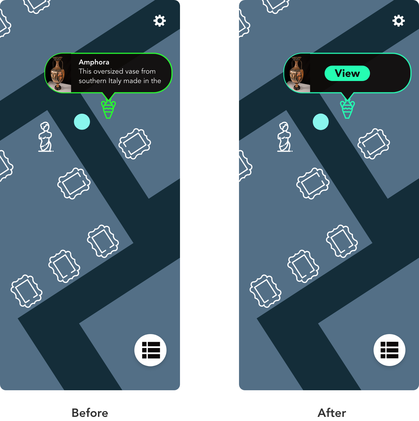
I noticed confusion by the user when the text bubble on the map would turn green. It was not a good indicator on what to do next.
Improvements
When the user is in proximity of the exhibit, a button will show up on the text bubble guiding them to view the content.
The green color of the outline and icon was changed to one that would better match the tone of the app.
Conclusion
Working on this case study was an enjoyable experience. It was interesting to learn about the different reasons why people enjoy going to museums and their concerns about visiting museums during a global pandemic. My goal was to find a solution that would keep people safe and encourage them to visit museums. This app would minimize the need to crowd around exhibits, as well as the need to interact with tactile experiences such as push buttons. By reducing the risk of getting sick, museums build more trust with their customers, ultimately increasing the amount of visits per day.