
Project details
While doing my internship at Streemly, I was given the task to redesign their marketing website, as the message of the company had changed.
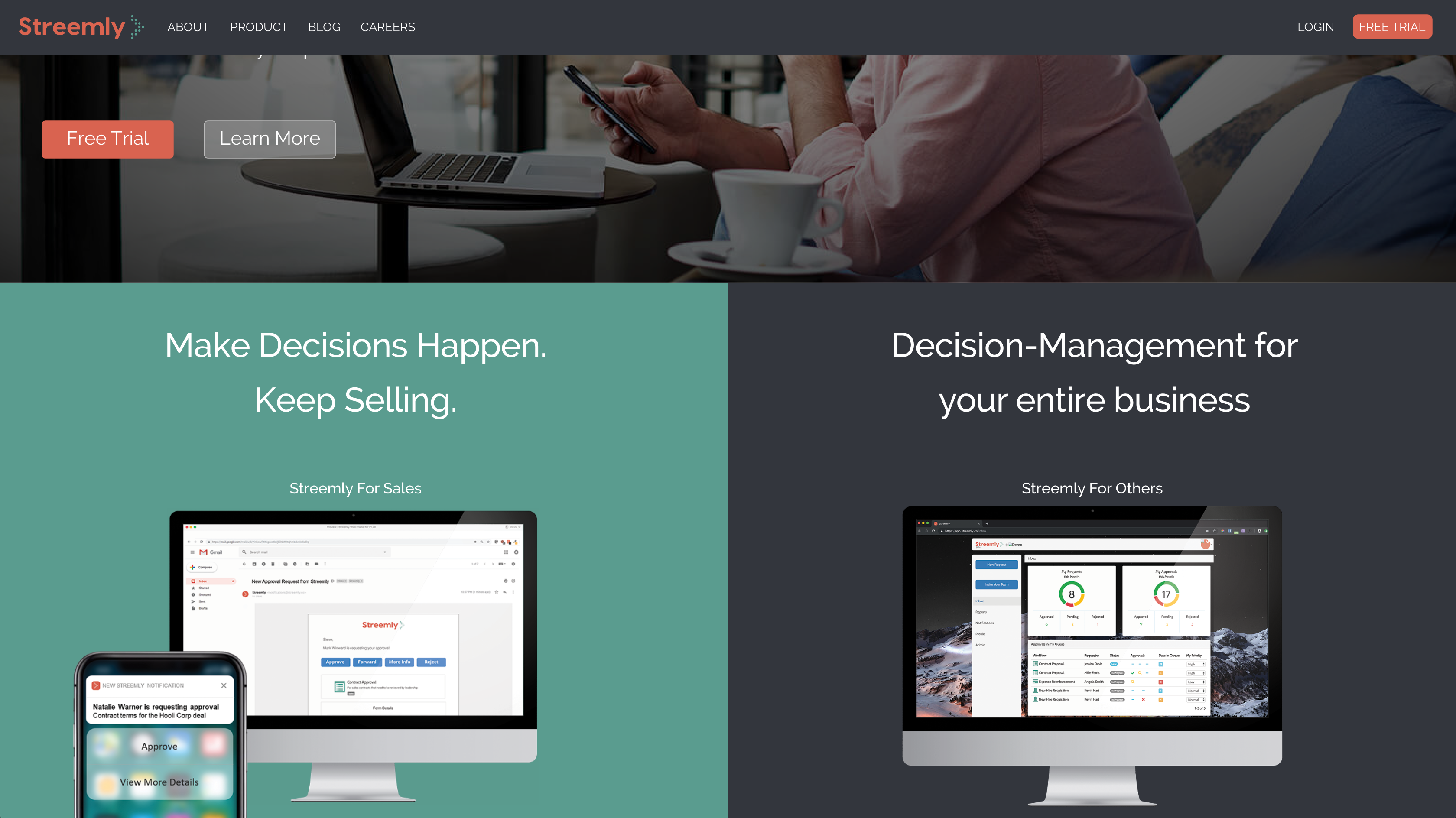
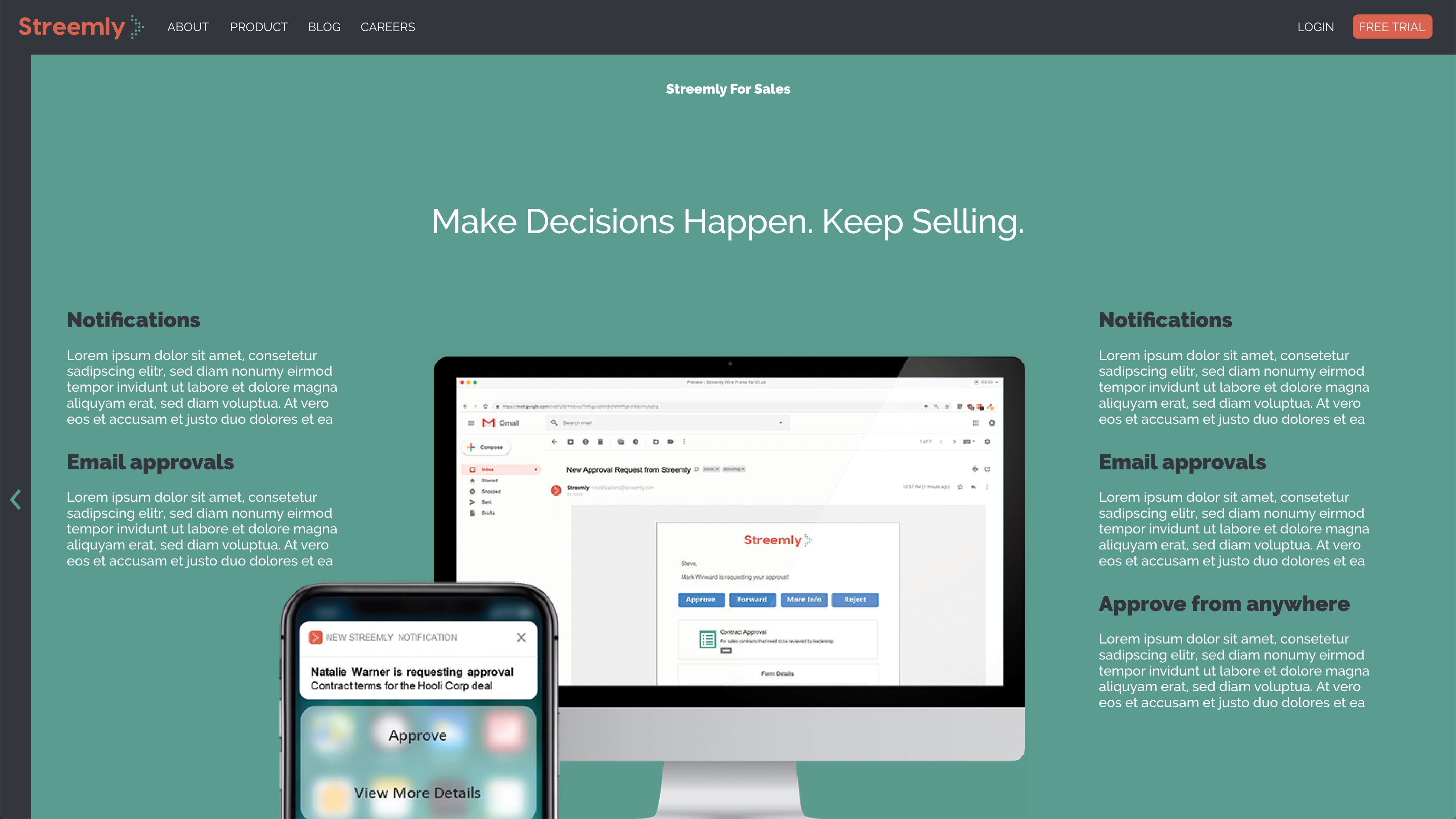
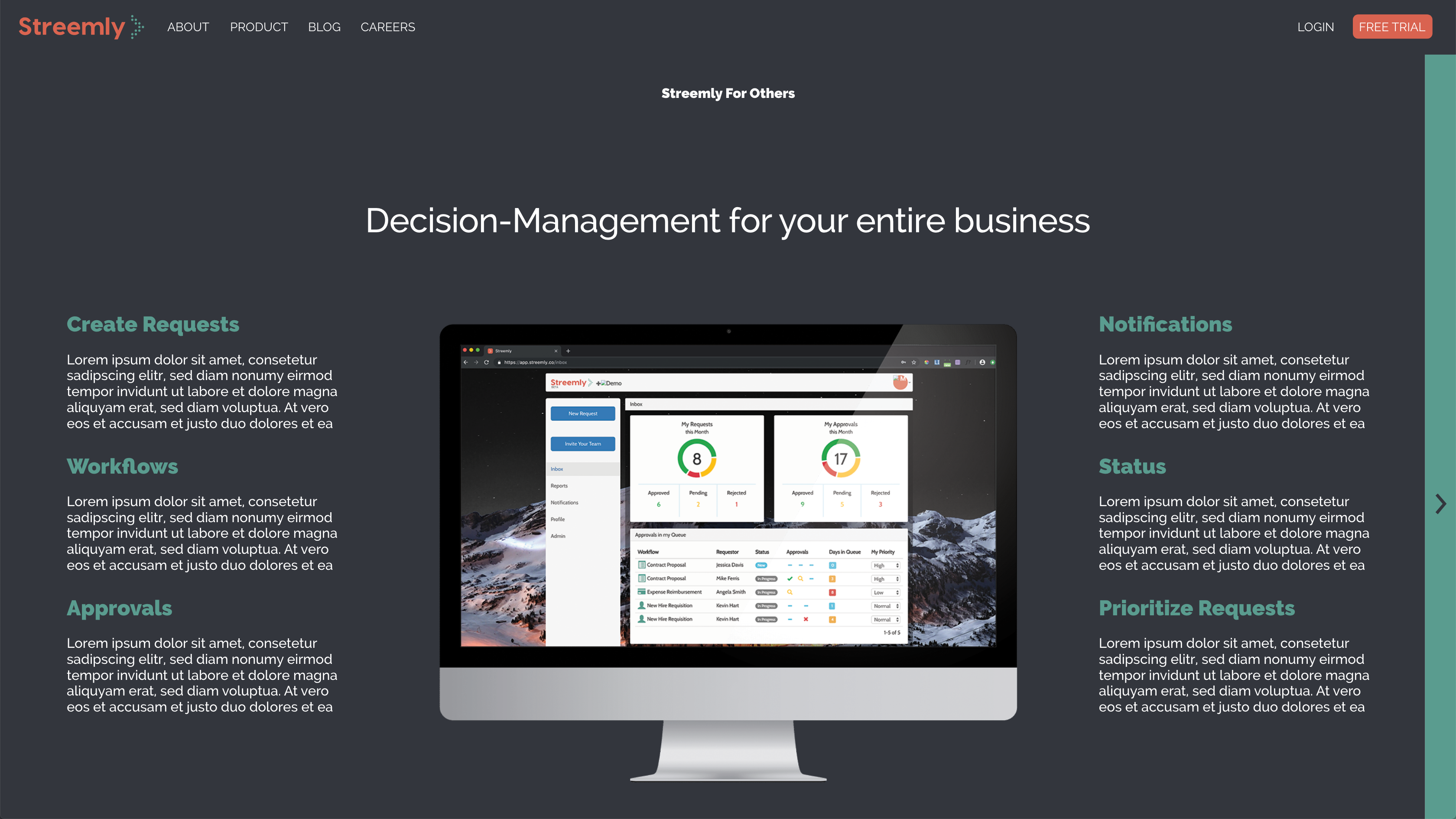
I met with the CTO and CEO of the company to define the companies goals and to discuss what their vision was for the website. One thing that really stuck out to me was that they were targeting two types of audiences and wanted to have a way for the user to choose a path when visiting the website, depending on the user’s needs.
The Process
Research
I began the project by doing research on other saas companies to see what worked for them, what hadn’t, and get some inspiration for my design. It wasn’t hard to spot the things they all had in common, a “free trial” call to action, images and information of their product. All of these companies conveyed their information differently depending on their audience and that’s where I was going to focus on the most on my design.
Sketching and Wireframe
I begin sketching ideas of how I was going to convey the information for the different users the company was targeting. During the meeting with the CTO I was told they wanted to do something like “choose your own adventure” where the user would have two different paths depending what they’re looking for on the product, this helped me come up with the wireframe. The idea was to have two images side by side depicting what the product can do for the different users, the user would then click on one and be taken to another page where they would learn more about how this product would solve their problem.
Prototype
After creating the low fidelity wireframes, I gathered the necessary assets from the CTO for the design. I was given the color scheme the company uses, logo and fonts to use. I used the assets to create the prototype that would later be shown and passed off by the CTO, who would then be doing the remaining copywriting.

